What is a mobile friendly website?
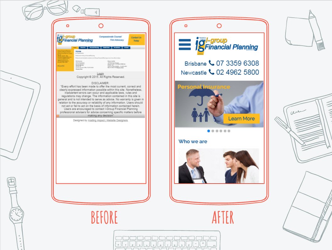
An example website upgrade before and after for one of our clients.
To be mobile friendly this website has:
- a clearly visible phone number which when you tap with your finger it calls using your phone automatically.
- a mobile main menu denoted by 3 stacked lines (made popular by Facebook mobile app)
- a bigger logo to clearly show the company
- slightly bigger text so it is readable without zooming in
- a slider which can be swiped with the finger back and forth
- bigger clickable call to action buttons to find more information
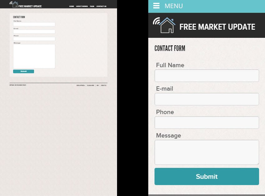
Another example upgrade we have done for one of our clients:
To be mobile friendly this website has:
- a bigger contact form which resizes to the mobile screen size
- a mobile menu which loads on finger tap
- a bigger more visible logo and title
If you would like a website upgrade feel free to contact us for a free quote!


Leave a Reply
Want to join the discussion?Feel free to contribute!